Who We Are
CI
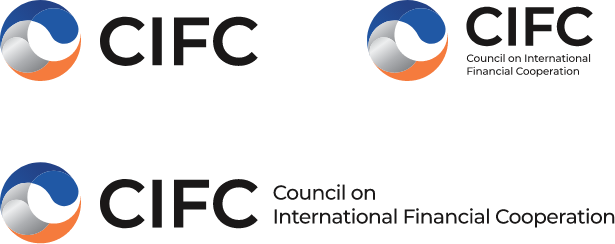
Symbol

The CI of CIFC was inspired by the key principle of ‘cooperation’. The close network of CIFC and global financial institutions is visualized in a round shape consisting of various curves, forming both a sphere that stands for the Earth and also the letter ‘C’ which indicates CIFC.
The image symbolizes ‘CIFC’, the global cooperation council, and the ‘connection’ and ‘cooperation’ of global financial companies. The emblem is also comprised of two interlocking waves of the Taegeuk diagram. It embodies a dynamic energy that highlights the preeminence of Korea’s representative global cooperation council, and the momentum towards an even brighter future for global finance through global financial cooperation.
Color
-
CIFC Blue 1 PANTONE 2727 C
-
CIFC Blue 2 PANTONE 2131 C
-
40%
5%
30%
50%
CIFC Silver Gradient PANTONE Black 6 C
-
CIFC Orange PANTONE 2025 C
-
CIFC Black PANTONE Black 6 C
The trustworthy and heavy dark blue shade stands for the trust and stability of CIFC and silver has been used for bringing up the image of finance. The orange color, which is a blend of the authentically Korean shade red and a warm yellow, embodies the spirit of convergence and partnership.